Case study — Yahoo Mail
Empty states, full personality
A voice system for inbox empty states that balances clarity, humor, and tonal range across fifteen surfaces in Yahoo Mail.
Overview
The challenge
Empty states are the most overlooked real estate in any product. They often appear when users are at a dead end — a folder with nothing in it, a search that returned nothing, an inbox they’ve never used. Most products treat them as an afterthought: “Nothing here.” Done.
My partners and I had the opportunity to do something different, to use these moments to express a distinct personality while still being genuinely useful. The challenge was knowing when to be playful, and when to just get out of the way.
My role
Writing and illustration direction across eight surfaces
I wrote the copy for each empty state and collaborated with the illustration team on pairing to make sure the visual and verbal voice reinforced each other. Each state needed its own personality calibration based on the user’s emotional context when they land there.
The strategy
Tone as a design decision
Not every empty state should be fun. A user who just searched for an email and found nothing is probably frustrated, so something like a pun would land wrong. But a user landing on their Spam folder for the first time isn’t stressed at all. That’s a moment to spark some delight.
The framework I used: match the tone to the user’s emotional state when they arrive at that screen, not to a blanket brand voice.
“The copy isn’t just filling space, it’s surfacing our unique brand and personality right when the user has nothing else to look at.”
To make this framework legible to the whole team, I built a tonal ladder consisting of seven named directions ranging from purely functional to fully voiced, applied across every folder surface in parallel. Named directions included “No frills, no fun,” “Message type + appear here,” “Educational w/subline + CTA,” “More voice, more fun,” and “A happy medium?” Presenting them as a spectrum gave the team a shared vocabulary for the tradeoffs — and made the final direction a deliberate choice rather than a default.
The work
Fifteen states, fifteen tonal decisions
Each entry shows the copy, its context, and the reasoning behind the tone choice.
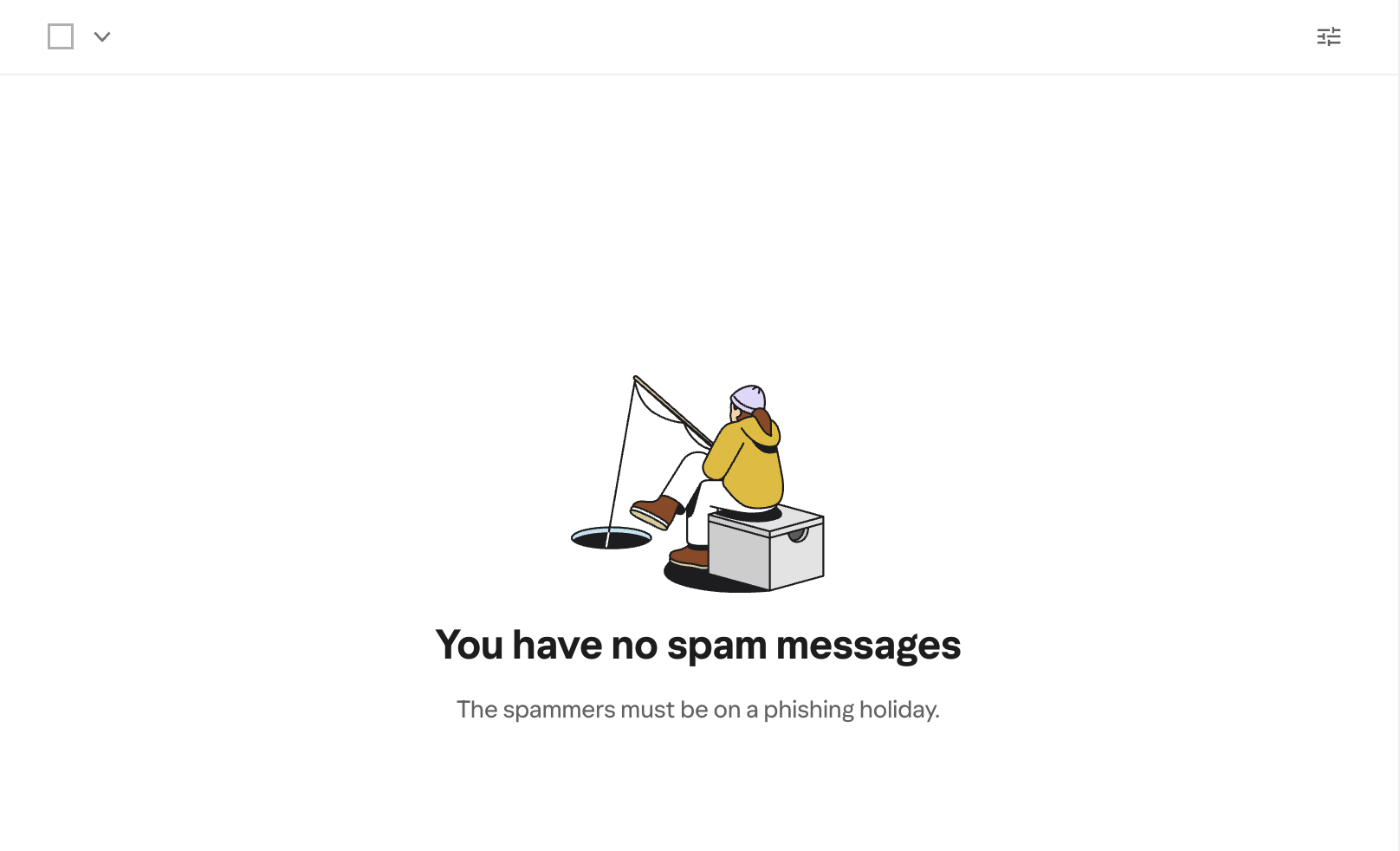
Spam
You have no spam messages
The spammers must be on a phishing holiday.
The standout of the set. The phishing/fishing pun is completely on-context. A fishing illustration reinforces the joke. Delights without trying too hard.
PlayfulNewsletters
No news, just peace and pigeons
Newsletters and digests appear here.
Alliteration, visual callback to the pigeon illustration, and a calm emotional beat. Body copy grounds it quickly.
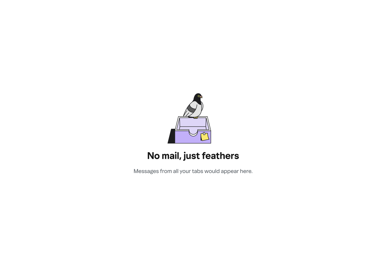
PlayfulAll tabs / Primary
No mail, just feathers
Messages from all your tabs would appear here.
The bird motif carries across the whole system. Short, whimsical headline; functional body copy. The pigeon-on-inbox-tray illustration does the heavy lifting.
PlayfulSocial updates
No new chirps from your peeps
Updates from social media sites appear here.
Borrows the register of social media itself to match the context. Body copy stays plain to anchor meaning.
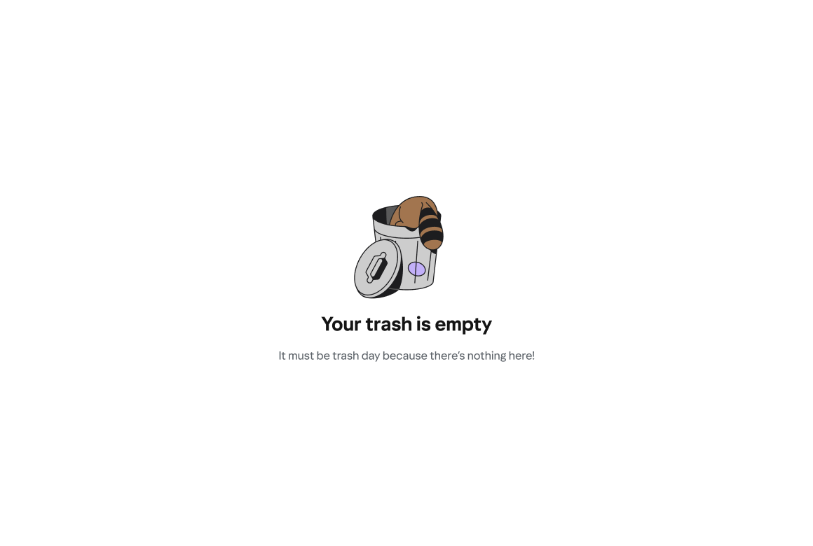
PlayfulTrash
Your trash is empty
It must be trash day because there’s nothing here!
A light, neighborhood-friendly metaphor. The raccoon-in-trash-can illustration makes this one of the most fun pairings in the set.
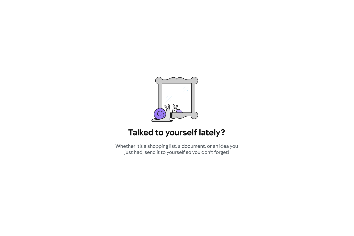
PlayfulEmails to Myself
Talked to yourself lately?
Whether it’s a shopping list, a document, or an idea you just had, send it to yourself so you don’t forget!
The only state that doubles as a feature prompt. The question format is inviting, not pushy. Paired with a snail looking in a mirror — a clever self-reflection visual.
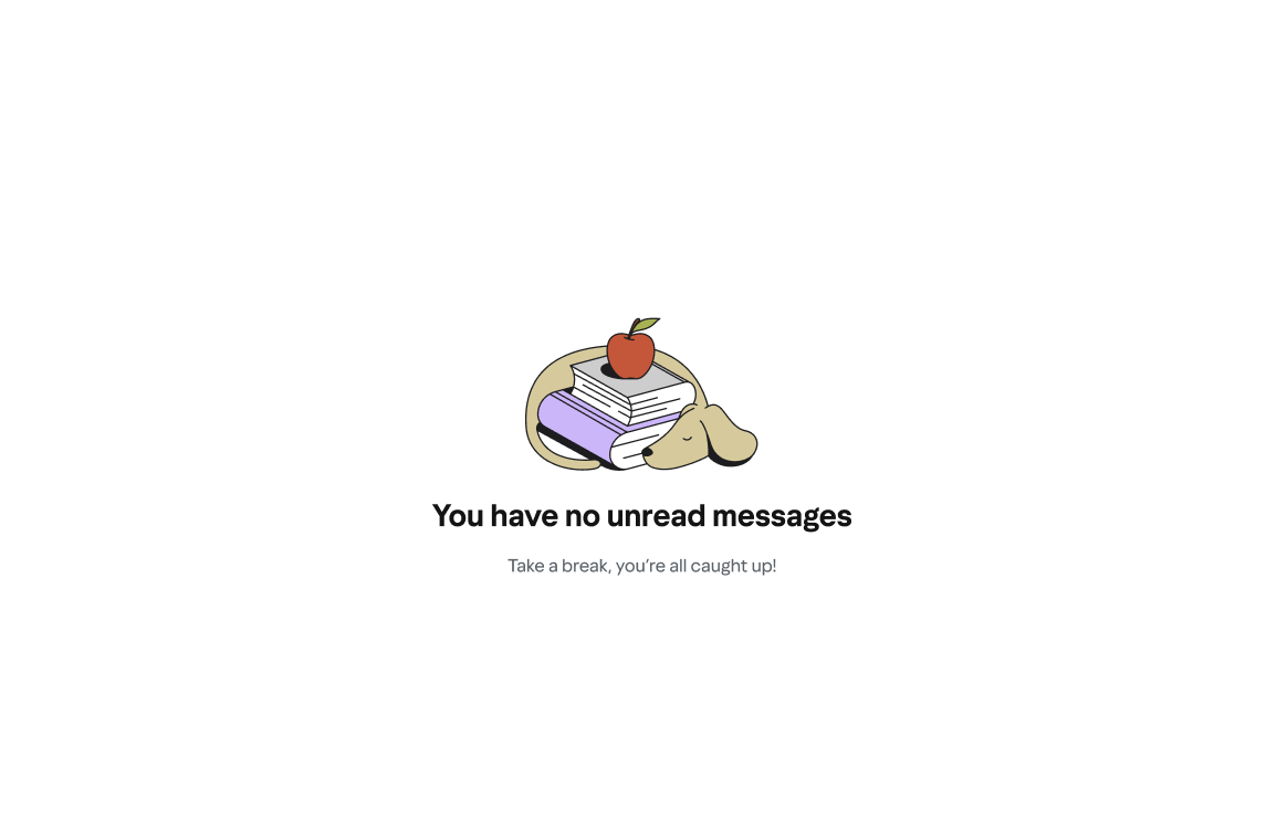
Warm & promptingUnread
You have no unread messages
Take a break, you’re all caught up!
A small celebration of inbox zero. The exclamation point earns its place here — this is the one moment users deserve a win. Paired with a dog napping on books.
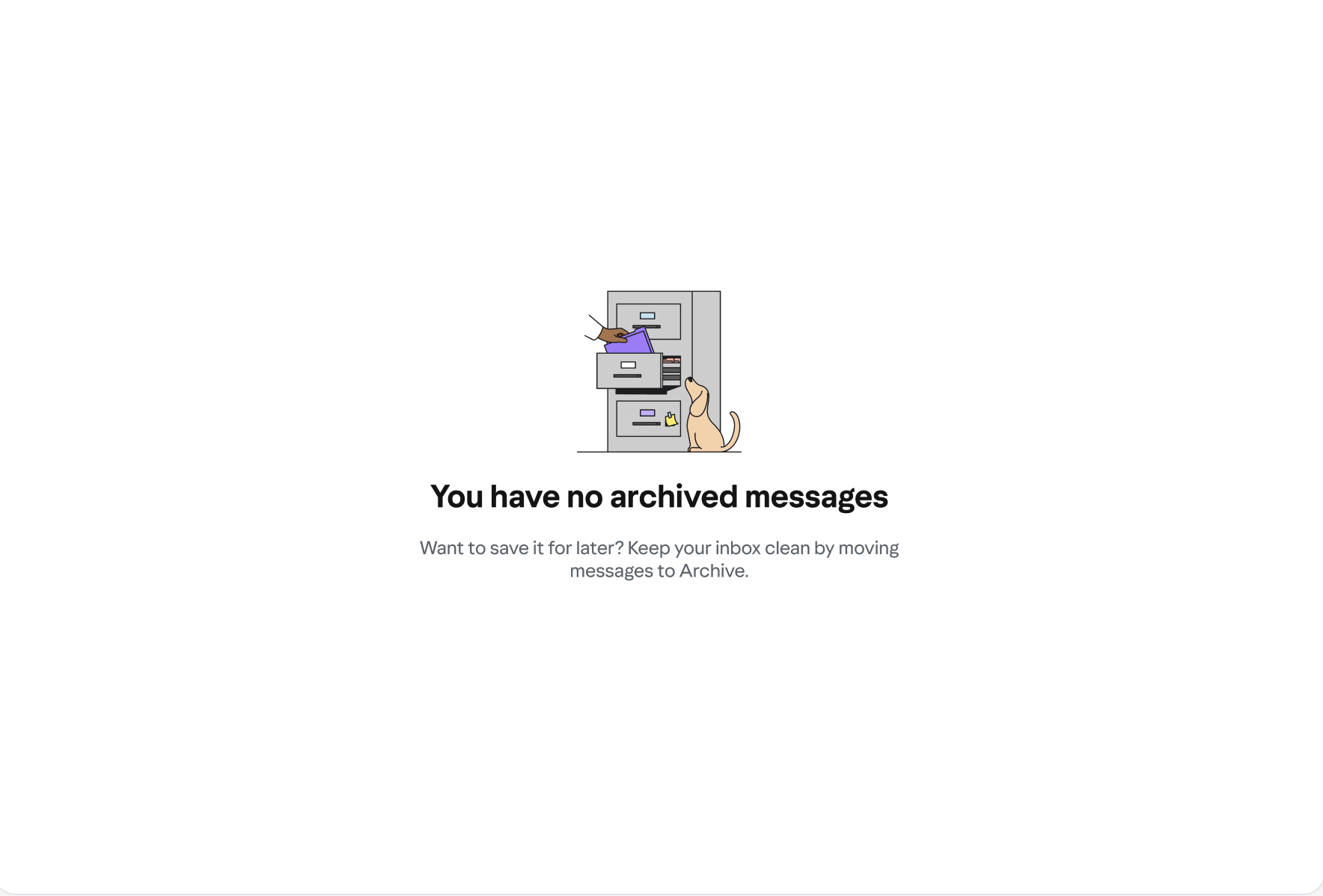
CelebratoryArchive
You have no archived messages
Want to save it for later? Keep your inbox clean by moving messages to Archive.
Teaches the feature value without being preachy. The question-then-answer structure mirrors how a real person would explain it.
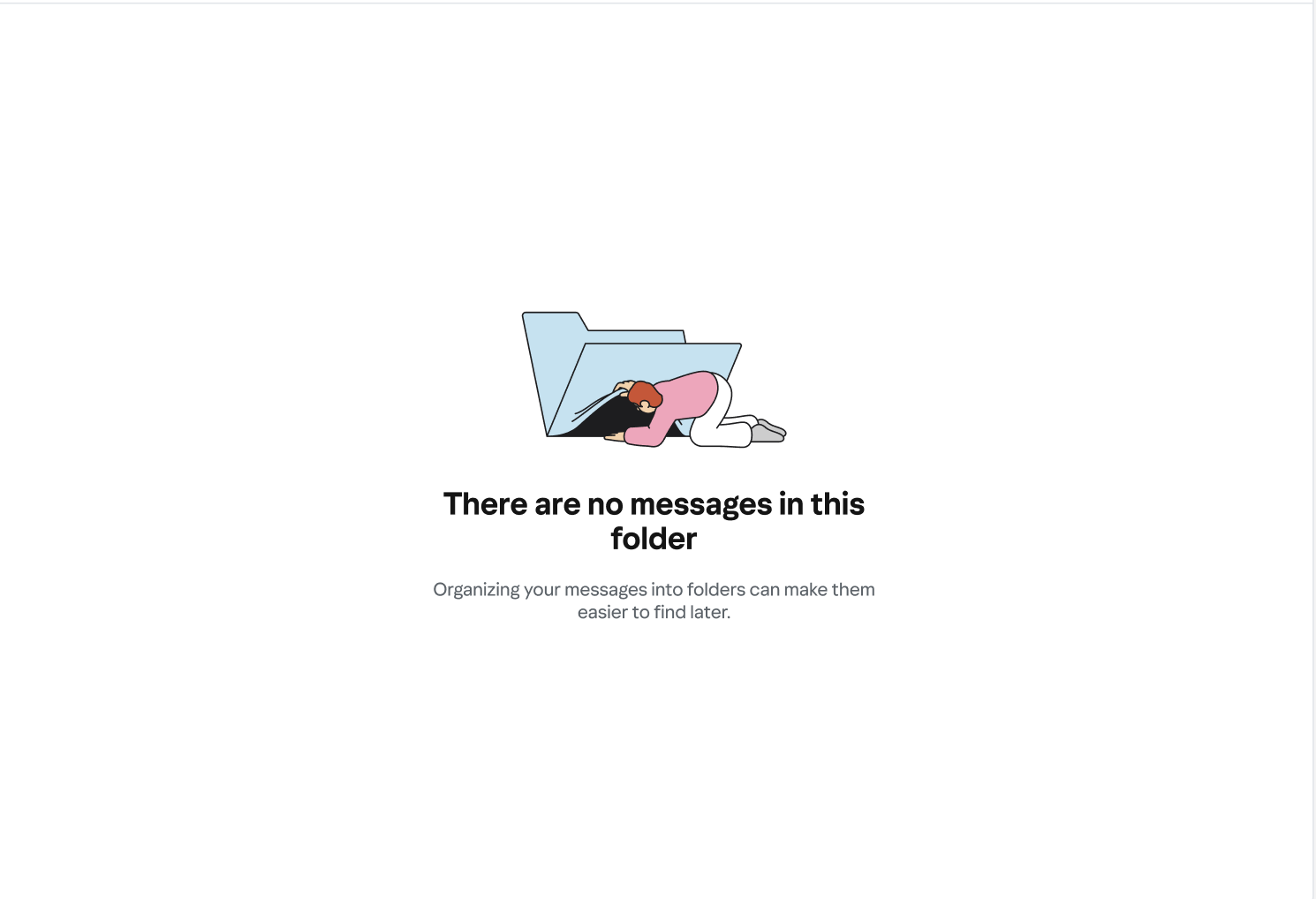
Helpful & instructionalEmpty folder
There are no messages in this folder
Organizing your messages into folders can make them easier to find later.
A generic surface that could belong to any user-created folder. Neutral tone, with a gentle nudge toward the value of folders. Illustration: person climbing into a folder.
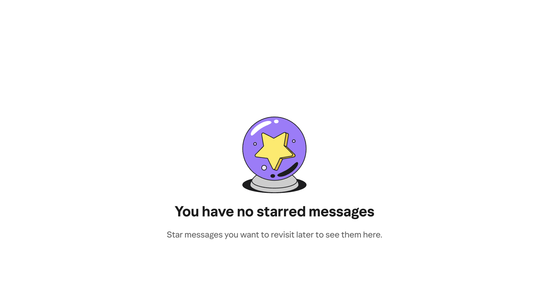
InstructionalStarred
You have no starred messages
Star messages you want to revisit later to see them here.
Teaches the feature clearly. Paired with a crystal ball — a subtle visual wink without the copy having to do the heavy lifting.
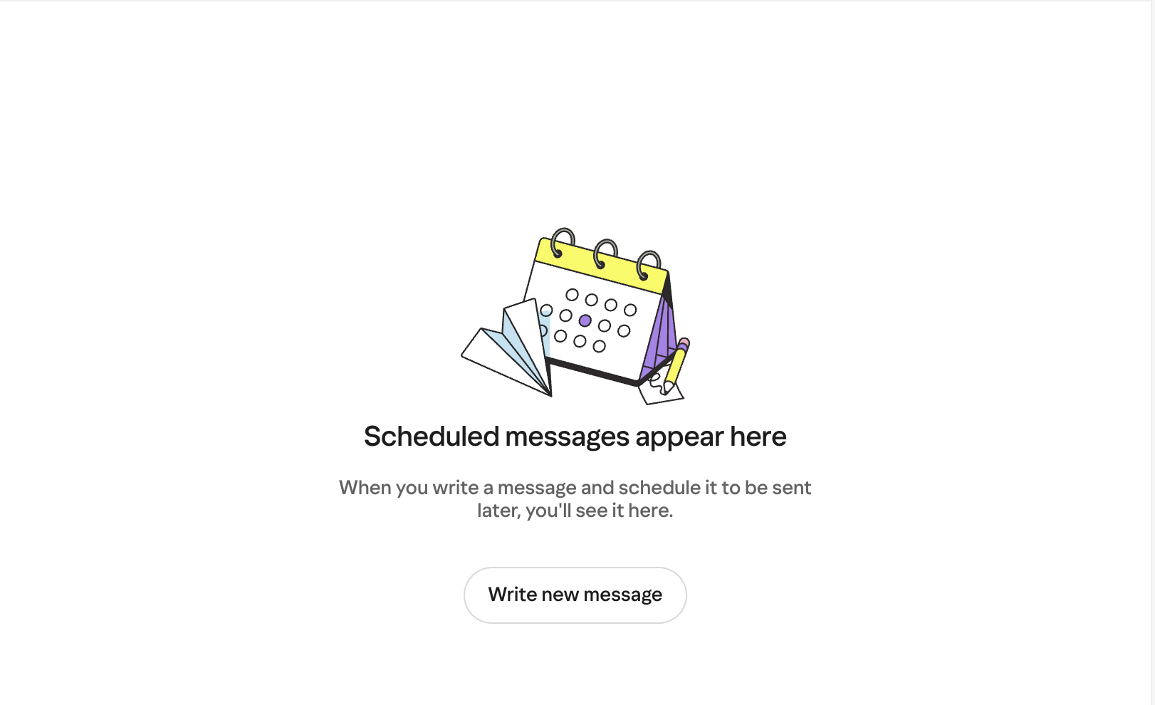
Warm & clearScheduled
Scheduled messages appear here
When you write a message and schedule it to be sent later, you’ll see it here.
Intentionally instructional — Scheduled is a less-familiar feature. Users here need orientation more than delight.
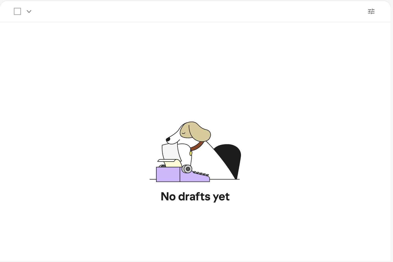
InstructionalDrafts
No drafts yet
—
“Yet” is the whole move. Optimistic without being saccharine. The dog-at-a-typewriter illustration provides warmth; the copy stays out of the way.
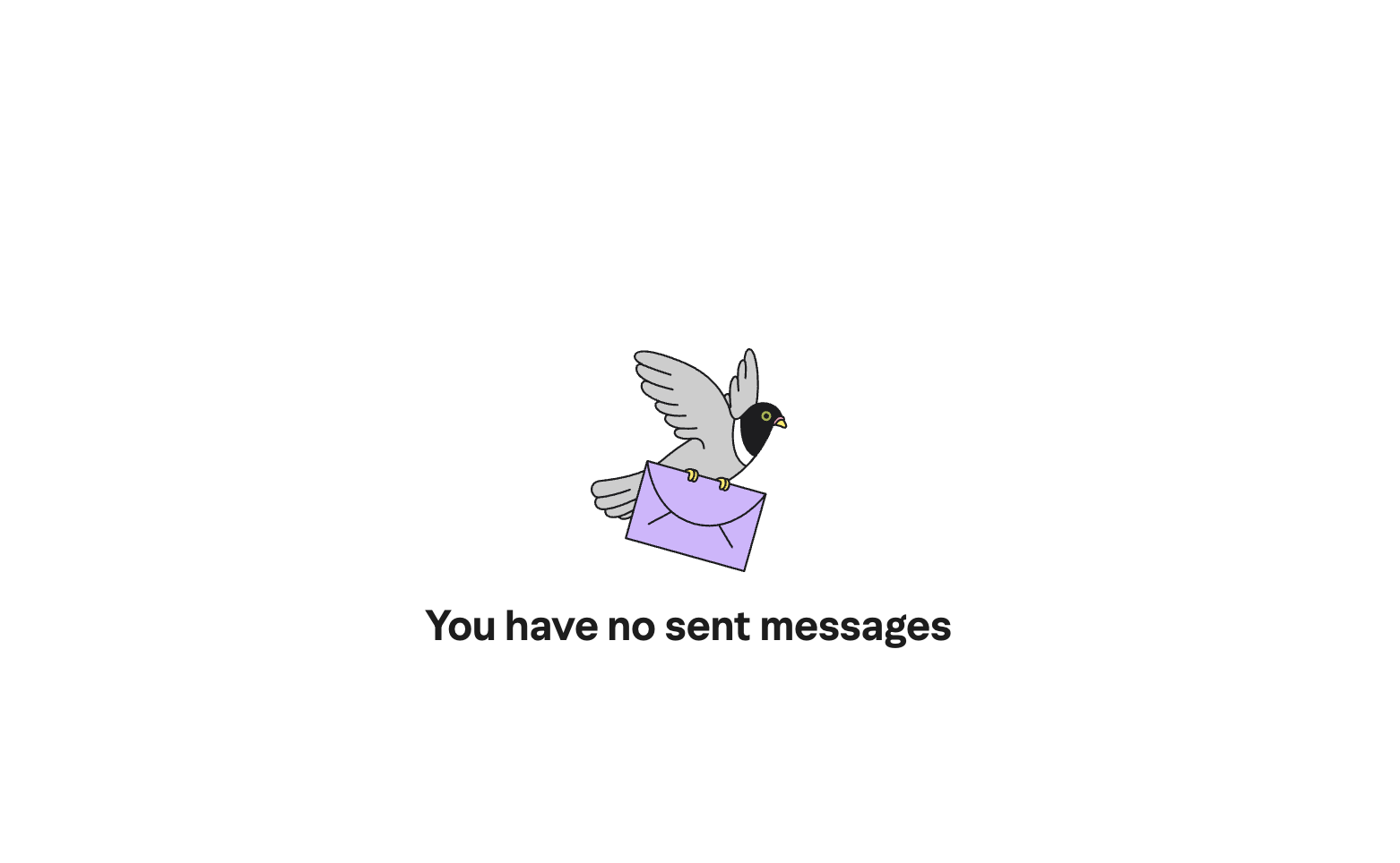
OptimisticSent
You have no sent messages
—
Clean and honest. The carrier pigeon illustration carries the personality. The copy appropriately steps back.
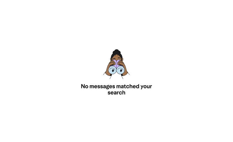
NeutralSearch — no results
No messages matched your search.
—
The only frustrated user in the set. Precise and non-playful by design. A pun here would feel tone-deaf. The period makes it feel final and honest.
Neutral & preciseProcess
Exploring before landing
The final states didn’t arrive fully formed. An earlier Oasis exploration phase ran multiple copy directions and illustration styles in parallel across every surface at once — different headlines, different tones, different relationships between text and image. The grid format let the team compare options quickly and make the voice decision as a deliberate, documented choice.
I also collaborated closely with the illustration team on concepts by suggesting imagery, reacting to sketches, and in several cases letting the copy direction generate the illustration idea rather than the other way around. The fishing/phishing joke, for instance, started in the copy and became the visual brief.
Inclusive design
Writing for people who can’t see the illustrations
I also wrote alt text for the Inclusive Design team so that screen reader users could experience something of the illustration’s personality. The goal was to preserve as much of the wit and warmth as possible for users who’d never see the image.
Craft notes
Tonal range as a skill
The most important thing this collection demonstrates isn’t any single line — it’s the range. Spam gets a pun. Trash gets a neighborhood metaphor. Unread gets a small celebration. Search gets nothing but precision. They all come from the same voice system. The discipline is knowing which register to use and why, as well as documenting that reasoning so others can apply it too.
The illustration pairings were content decisions, not coincidences: the fishing/phishing visual joke, the snail-in-a-mirror for Emails to Myself, the raccoon for Trash. Several illustration concepts grew directly from the copy direction. And the alt text brought the same care full circle — making the personality accessible to users who’d never see the images.
Outcomes
What the work achieved
A consistent voice system across 15 inbox surfaces, with tonal variation calibrated to user emotional context
A documented tonal ladder that gave the team a shared vocabulary for voice decisions — making the final direction a choice, not a default
Illustration direction informed by copy — verbal and visual personality designed in tandem, with several concepts originating from the writing
Alt text for the full illustration set, extending the wit and warmth of the system to screen reader users
Reflection
What I’d build on
The tonal ladder was the right call, and I’d push it further — turning it into a living reference doc that PMs and engineers could consult when new surfaces are added, without needing a content designer in the room. The framework exists; the next step is making it self-serve. I’d also want to run A/B tests on a few of the more playful states to validate that voice actually drives better engagement than neutral copy on those surfaces.