Case study — Yahoo Mail
Giving Planner a voice
Content strategy and UX writing for a new productivity feature in Yahoo Mail, from onboarding to empty states.
Overview
The challenge
The idea behind Planner was that of a feature that surfaces tasks and calendar events directly inside the inbox. The concept was strong, but it came with a real content problem: how do you introduce a productivity tool to email users who didn’t ask for one, without overwhelming them or underselling what it can do?
The risk of getting it wrong was high in both directions. Too instructional, and people's eyes would glaze over and they'd leave before seeing the value. Too vague, and they’d never understand why Planner deserved a place in their inbox at all.
My role
Content design across the full sprint
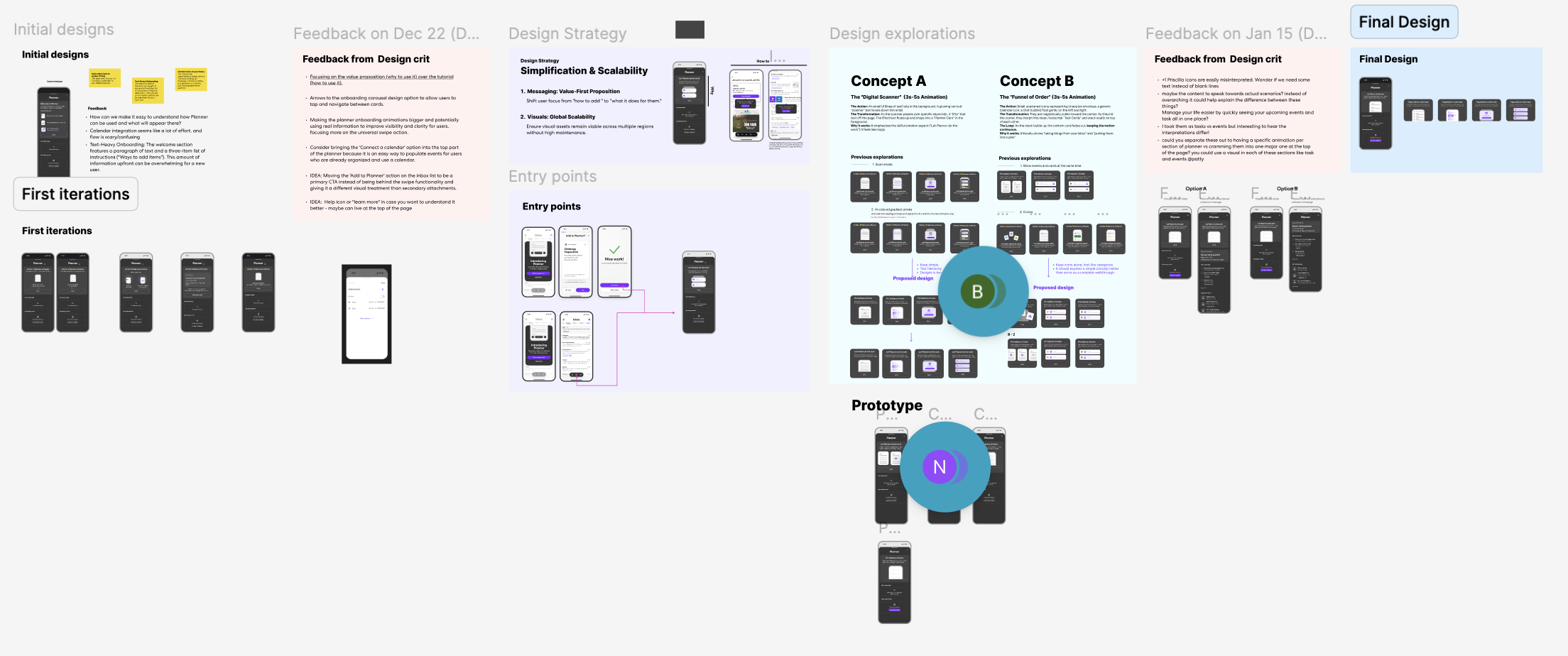
I was embedded in the design team from early explorations through final handoff. I attended leadership design crits, presented copy variations alongside visual concepts, and advocated for a content-first approach to onboarding.
The content challenge
Value before how-to
Early drafts of the onboarding framed Planner around its mechanics, things like how to add tasks and how to connect a calendar. User feedback showed people were tuning out because the feature just felt like homework.
The strategic shift we made was simple but meaningful: lead with what Planner does for you, not what you have to do to set it up. This became the north star for every copy decision on the project.
“Shift user focus from ‘how to add’ to ‘what it does for them.’”
Design strategy principle, developed with the teamThe work
Writing the moments that matter
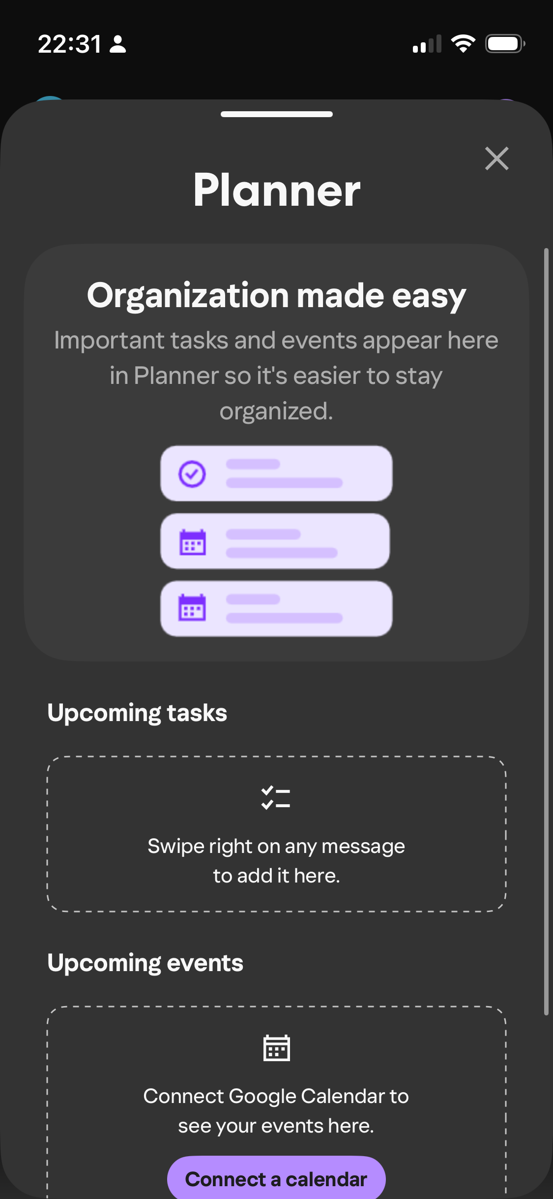
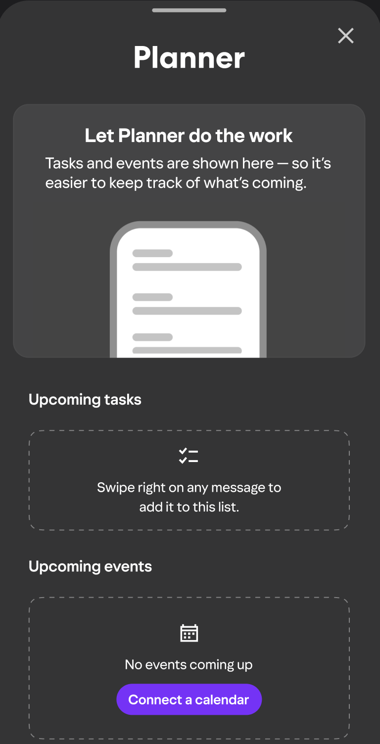
Hero value prop — onboarding screen
Let Planner do the work
Tasks and events are shown here — so it’s easier to keep track of what’s coming.
Leads with the benefit. The em dash creates a natural cause-effect beat without adding an extra sentence.
Empty state — upcoming tasks (first use)
Swipe right on any message to add it to this list.
Teaches the gesture at exactly the moment the user needs it. Actionable, not apologetic.
Empty state — upcoming events
No events coming up
+ Connect a calendar CTA
Honest without being discouraging. The CTA opens a path forward rather than leaving users stuck.
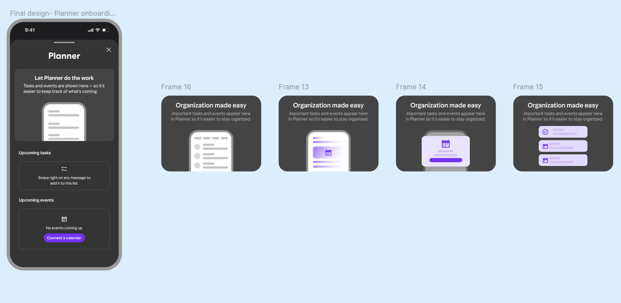
Onboarding card — iterated across 4 visual concepts
Organization made easy
Important tasks and events appear here in Planner so it’s easier to stay organized.
Tested against abstract illustration, a calendar icon, and a list UI — copy had to hold up regardless of which visual direction the team landed on.
Outcomes
What the work achieved
A scalable content system for Planner’s first impression across multiple entry points
Copy approved through a structured design crit process with Mail leadership
Onboarding reframed from instructional to benefit-led — a strategic shift adopted by the full team
Reflection
What I’d explore further
The empty state copy does its job — but I’d want to test whether a slightly warmer, more encouraging tone drives more first-use actions than the neutral instructional version. Small tone shifts in empty states can move engagement meaningfully, and this feels like a good candidate for an A/B test.