Case study — Snap
One word,
a different tone
Bringing the Spotlight tab’s onboarding in line with Snapchat’s positive, friendly voice.
In short: I changed “Swipe Up to Skip” to “Swipe Up for More,” so the gesture invites people to see more instead of suggesting the content isn’t worth their time.
The idea
Keeping the tone consistent
With the voice of most brands already established, a content designer’s job is to make sure the tone stays consistent everywhere, down to a single gesture hint.
“Don’t look at me in that tone of voice.”
Dorothy ParkerThe work
From skip to more
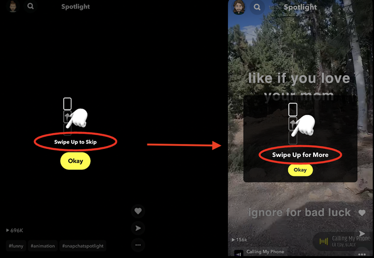
The issue
“Skip” says the content is skippable
A word like “skip” suggests the content isn’t worth people’s time.
Why it matters
Small words shape how people see the app
“Swipe Up to Skip” looks harmless, but it undercuts the way people perceive the app and everything in it.
The solution
“Swipe Up for More”
Same gesture, opposite message: what’s here is worth seeing more of.