With the voice of most brands already established, the content designer's job is to ensure that a brand’s tone stays consistent.

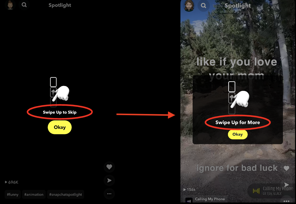
Here's a recent example of how I changed the existing copy in the Spotlight tab to better align with the positive, friendly tone Snapchat is attempting to project.

“Don’t look at me in that tone of voice” 

— Dorothy Parker

The Issue:

Using a word like “Skip” to describe content may leave users with the perception that this content is skippable, which is to say, not worth their time.

Why it Matters:

While on the surface “Swipe Up to Skip” may seem like an innocuous bit of copy, it’s damaging to the way users perceive the app and its content.

Solution:

“Swipe Up for More” suggests that, on the contrary, the content displayed here is worth seeing more of.

Previous
Previous

Inclusive Camera

Next
Next

Family Center